I really should get these reflections back on schedule. Perhaps it was the convergence of all assessments due around about the same time that threw me off track. But I digress.
In week 4, we actually all presented our early concepts for what we want to achieve in bookmarking. I learned that a lot of my classmates have a very good design sense. Their presentations looked very nice overall. I also realized that 3 minutes really isn’t much time so it was better to focus on the product pitch rather than too much user research. While I’m not discounting the importance of user research, spending too much time on that will really force you to compress the part where you’re actually pitching your product idea.
The class afterwards was focused on branding, something I’ve studied on and off over the course of the past 10 years. The ideas of the brand being worth perhaps more than the assets of the company was not really surprising, but rather inspiring. I guess a true brand is only built through time and history. This is the reason I personally feel why Apple is destroying their competitors. They have a brand. In fact they’re closer to a fashion label than they are a tech company. They never talk about specs, they talk about how wonderful their products are to use. Furthermore almost all celebrities use iPhones now. Android phones, while remarkable, are so concerned about specs and features – but their names just don’t bear any weight. HTC, Samsung, LG, Motorola, Lenovo, Asus, Oppo, Huawei – these are tech companies or appliance companies – they’re not brands that excite the public.
Having said that – it’s not impossible to create a brand now. OnePlus and Xiaomi in China have moved away from the spec battle and created phones that resonate with the people. They’re not the most powerful beasts, but they are relatively well built (and cheap). However, if you look at their marketing strategies – Xiaomi is focused mainly on fun while OnePlus is focused on exclusivity. There’s something about the products that a company makes over time that creates an affinity towards them. Companies such as Dyson – phenomenal engineering with industrial designs over many, many years put them high above the rest in terms of desirability for home appliances. We must also consider consistency because you can ruin a brand just as quickly as you’ve built one. Sony is the biggest culprit here. They used to be the market leader making the most desirable electronic products. Somewhere along the line, however, they’ve lost their way and are contented in sitting on the bylines creating decent products but not products that affect the zeitgeist.
I’m also struggling to remember which logos I like best. There’s a game on the app store called “guess the logo” and they just show you logos and you have to guess what company they belong to. You’ll be surprised how many logos have been burned into your brain. Unfortunately, there seems to be a disconnect between the best brands and the best logos. There are plenty of wonderful logos out there, but they’re not connected to any super brand. Anyways here’s my take on logos.
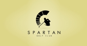
This one is really popular on the design blogs. The Spartan helmet. Unfortunately, I’ve never heard of the Spartan Golf Club.
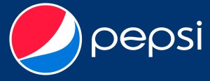
Pepsi’s logo is funny because it looks like a fat man’s belly sticking out from under his shirt.
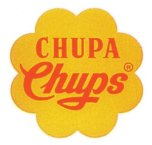
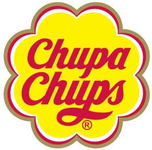
Now this one is a personal favourite not because of how it’s designed, but rather because it was designed by Salvador Dali. The logo was revised to the one on the right in 1988. Dali was adamant that the logo be placed on the top of the candy so it would remain whole.
Also I found this blog that shows the hidden meaning behind some logos. I didn’t know Toblerone’s logo had a bear in it!


Recent Comments